Your homepage is doing too much: give it a clear job
What to put on your homepage, what to move, and how to turn it into a story visitors can follow.

Jessie Borgmann
Founder, Dotted Octopus

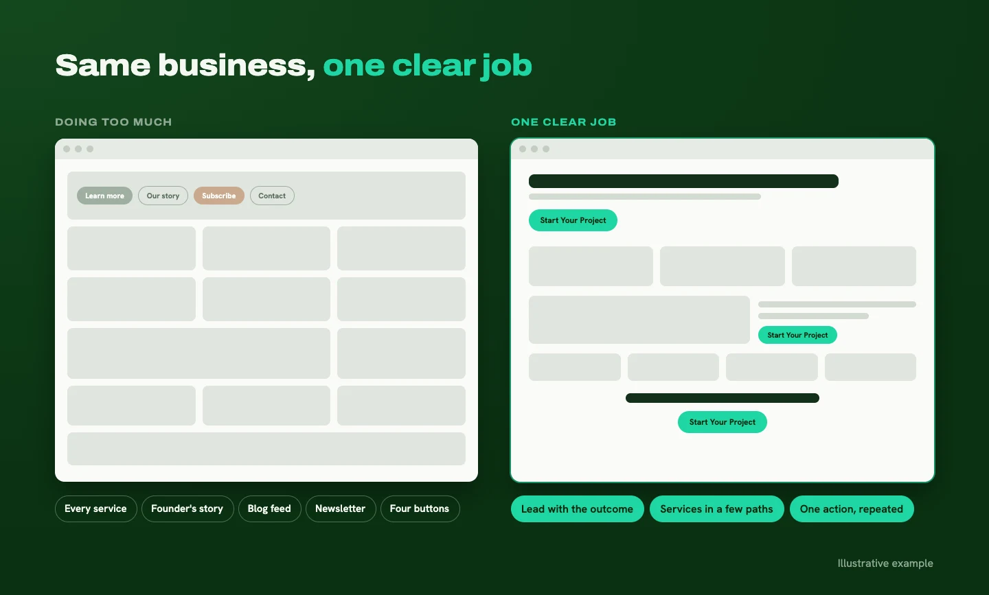
Scroll through a lot of service business homepages and you'll find the same thing: the company introduction, every service, the founder's story, the latest blog posts, a newsletter signup, and four different buttons, all competing for attention. Every piece made sense when it was added. Together, they make it hard to know where to start.
Your homepage has one job: help the right visitor understand how you can improve their situation, trust that you can deliver, and take a clear next step.
That's where your story starts. Everything on the page should either move that story forward or get out of its way. (The homepage is only the first chapter. Here's how the story continues across the rest of your site.)
Why homepages get crowded
Homepages rarely start out crowded. They get that way one reasonable addition at a time. A new service gets a section. A new idea gets a section. The blog gets a feed. Eventually everything has equal importance, which means nothing stands out.
What a homepage needs is an editorial decision: what's the main story, and what supports it? Visitors should be able to follow a clear thread from "this is relevant to me" to "here's what I can do next."
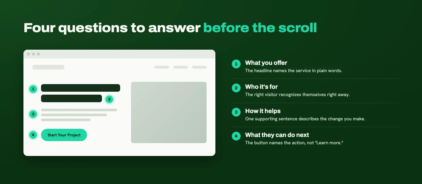
What visitors should understand before they scroll
The first screen of your homepage should answer four things:
- What you offer
- Who it's for
- How it helps
- What they can do next
A clear headline and one supporting sentence can do most of that work. The image should reinforce the message, and the button should describe the next action instead of just saying "Learn more."
Here's a sample of what that might look like for my own studio:
Your business has grown. Give it a website that tells the right story.
Website design and development for service businesses ready to turn an outdated or confusing site into a clear, memorable experience that builds trust and supports inquiries.
[Discuss Your Website]
You don't have to explain everything in the first screen. You need to give the right person a reason to keep reading.
Order your homepage sections like a story
Once you know the homepage's job, the sections below the first screen should read like a story your visitor is the main character in. I use this sequence as a starting point, then adjust it to the audience:
- Establish relevance. Here's what you help people accomplish.
- Show understanding. Here's the challenge they're dealing with.
- Explain the solution. Here's how your service helps, and why your approach makes sense.
- Build confidence. Here's relevant proof: testimonials, project examples, results you can stand behind.
- Make the process tangible. Here's what working together involves.
- Address hesitation. Here are answers to the questions holding people back.
- Invite action. Here's the next step.
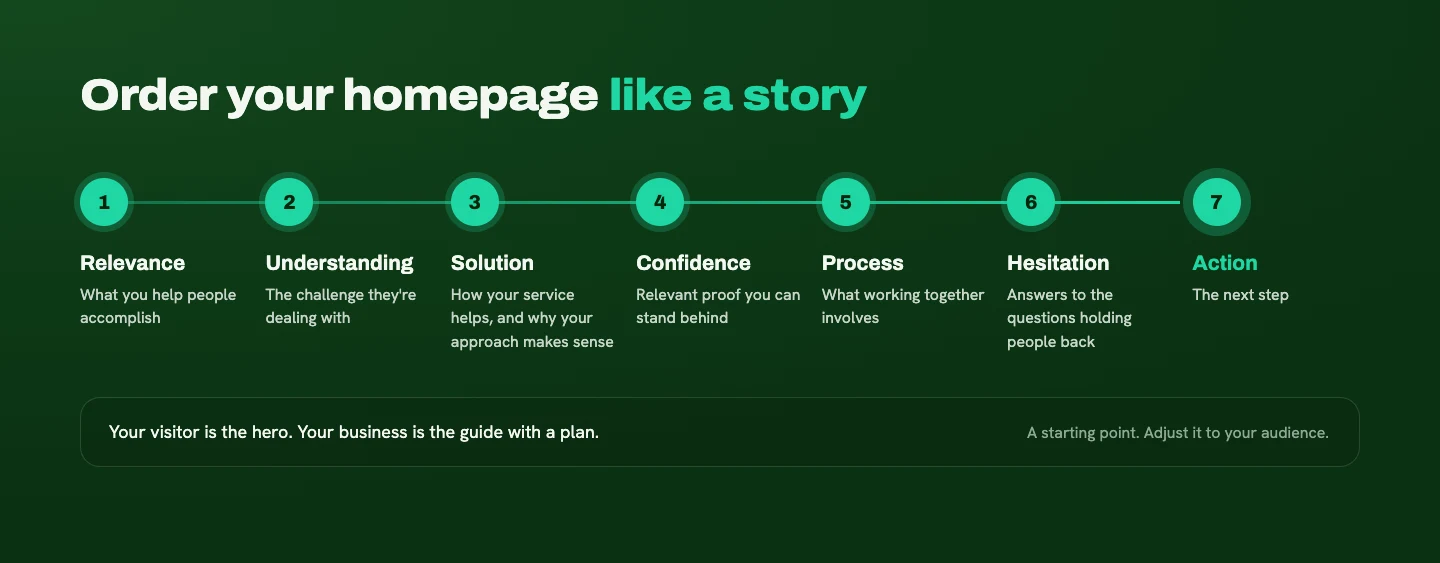
This follows Donald Miller's StoryBrand idea that the customer is the hero and your business is the guide, bringing experience and a plan. (More on that here.) Alex Hormozi's value framework adds a useful check: is the outcome clear, is there reason to believe it's achievable, and does the process feel manageable?
This isn't a rigid template. A business that gets most of its traffic from referrals may need reassurance earlier. An unfamiliar service may need more explanation up front. And the first chance to get in touch shouldn't be buried at the very bottom.
One primary action, not one button
How many calls to action should a homepage have? I plan for one primary action, rather than one button.
You can repeat that same action in sensible places: the first screen, after relevant proof, and near the end. Repetition lets people act whenever they're ready, without hunting for the button. (For the rest of your site, here's where to put calls to action beyond the homepage.)
Then add one useful option for people who need more confidence first, like viewing a case study, reading a guide, or watching a short explanation. The hierarchy should be obvious. "Book a consultation" stays prominent, while "See how the process works" offers a smaller step.
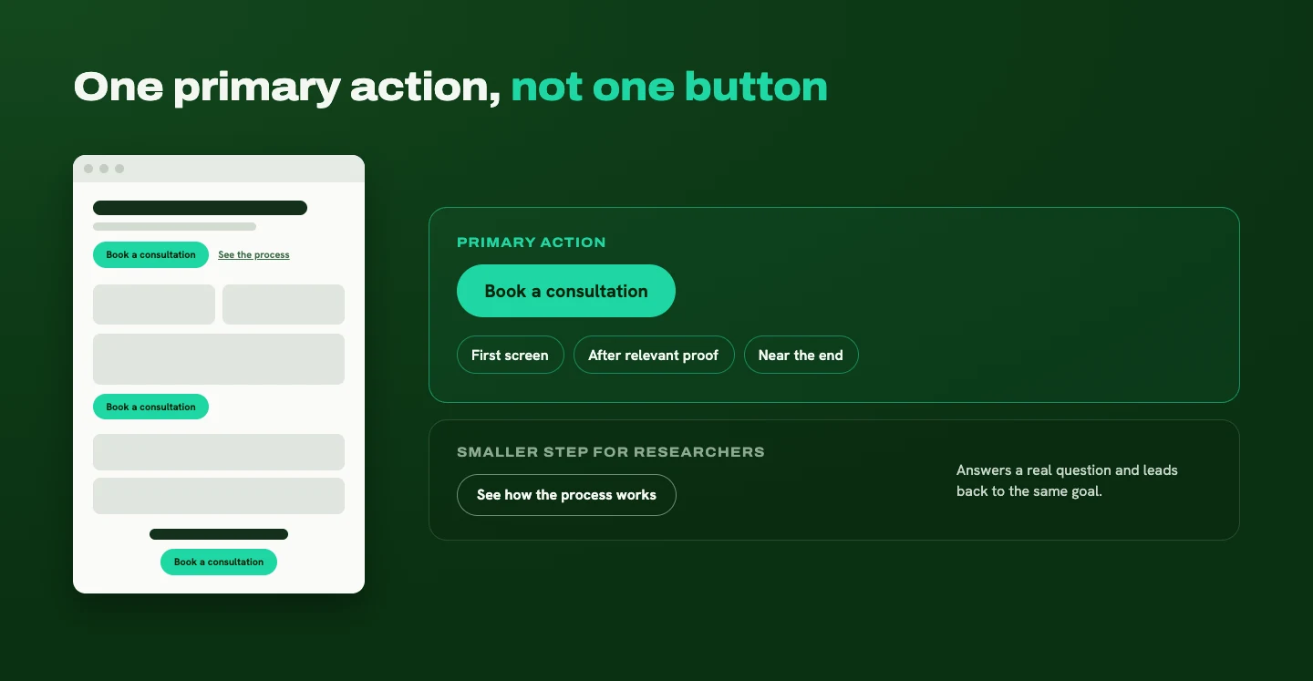
That secondary path needs to answer a real question and build toward the same goal. Sending people off to an unrelated newsletter or download splits the story in two. (I wrote more about why smaller next steps matter in my post on websites that aren't generating leads.)
What stays on the homepage, and what moves
For every section, I ask what role it plays in the visitor's decision. Does it clarify the offer, help someone recognize their problem, build trust, answer an important objection, or guide the next step? If it does, it may belong.
If it needs a detailed explanation, introduce it briefly and link to a dedicated page. That usually applies to individual services, the company history, technical details, and full case studies.

Something can be important to your business without needing a large section on the homepage. Moving it gives it a better home and makes the main story easier to follow.
The hardest things to cut
The two things owners are most reluctant to trim are the company history and the complete list of everything they do. That's understandable. Those details represent years of work, and narrowing the message can feel like leaving part of the business behind.

Here's how I see it: nothing has to disappear. The real decision is the order in which people learn about it. A new visitor needs to see the connection to their own situation before a long history means much to them. Keep a short detail that establishes credibility, like years in business or a notable client, and link to the fuller story. Summarize your services and give each one room on its own page.
The goal is a homepage you're proud of that also helps visitors understand why your business matters to them.
When you have several services or audiences
Start with what connects them. What common outcome does your business help people achieve? That gives the homepage its central message. Then group services into a few understandable paths and link to pages with the detail.
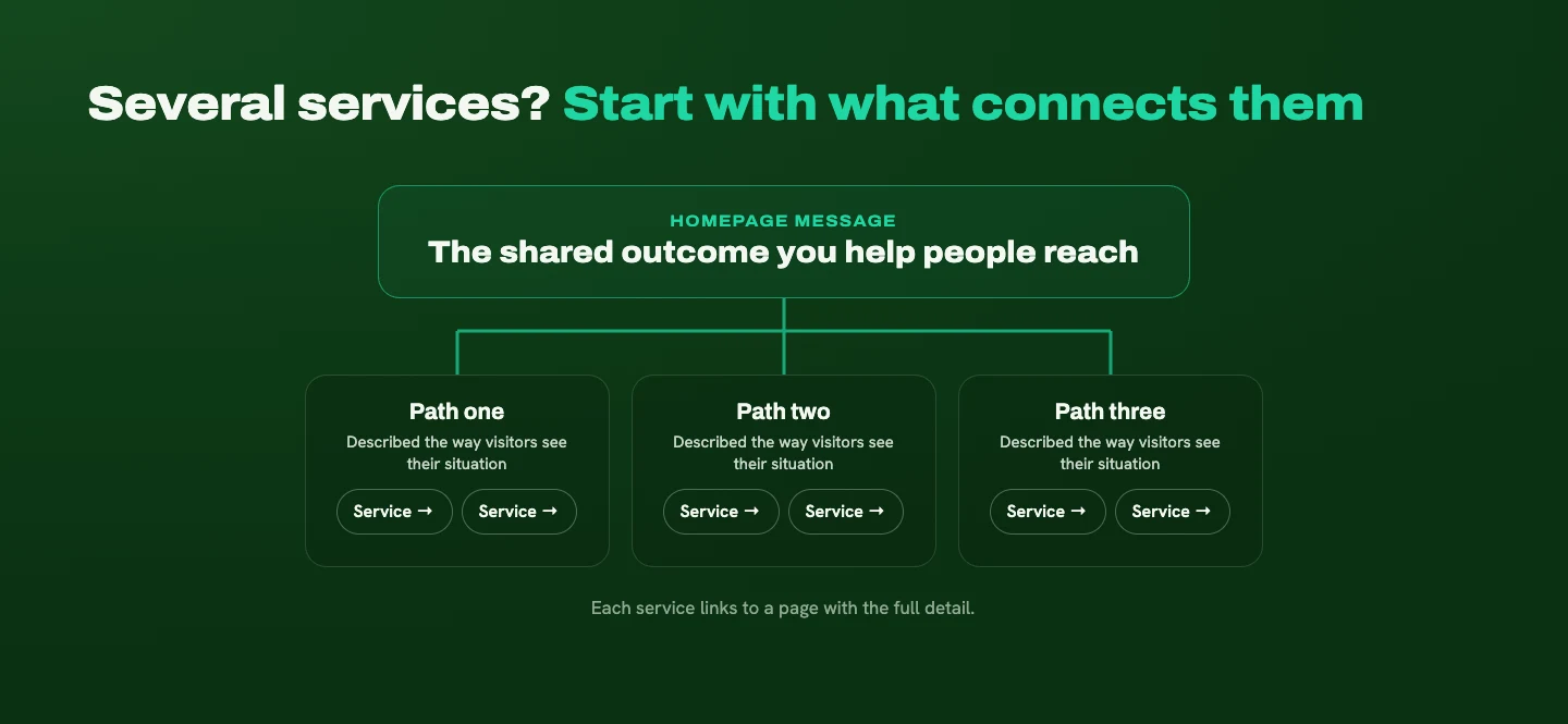
For several audiences, use descriptions that help visitors recognize their situation. They shouldn't have to decode internal department names to find the right service. If your audiences have very different needs, dedicated landing pages can carry different stories. The homepage can help people choose their path without trying to tell every version at once.
What this can look like
An illustrative scenario, not a client story. Picture a consulting business whose homepage gives equal space to six services, the founder's biography, recent blog posts, a newsletter signup, and several different buttons. Each section is well made. None of them tells the visitor where to begin.
The fix starts by identifying the shared outcome those six services help clients reach. The homepage then leads with that outcome, groups the services into a few clear paths, shows one relevant project example, and explains what happens on an introductory call. The primary action is easy to find, and visitors who are still researching can explore a case study first.
Nothing important disappeared. The homepage just has a coherent story now, and every section has a purpose.
Give your homepage one job, and let everything else support it
Your homepage doesn't need to say everything. It needs to help the right visitor see that you understand their situation, trust that you can help, and know what to do next. Decide on the main story, give every section a role in it, and move the rest to pages built to hold it.
If your homepage has turned into a collection of everything your business does, I can help you find the story and give it a clear job again. Tell me about your business, and I'll share where I'd start.
Ready for a website that makes this easier?
Tell me about your business and your goals. I'll help you figure out what your website needs to say, and how to make it clear.
Start Your ProjectLiked this one? Get the next article in your inbox.
Your website should work as hard as you do. Each new article shows you where yours is quietly losing leads, trust, or attention, and exactly what to fix. It lands in your inbox the day it's published, and you can unsubscribe whenever you like.
You're on the list. Thanks for subscribing!
Something went wrong. Please try again in a moment.

A strategy-led design studio creating clear, thoughtful websites for B2B and professional-service businesses.
Start Your ProjectDotted Octopus
© 2026 Dotted Octopus. All Rights Reserved.
Back to top ↑